
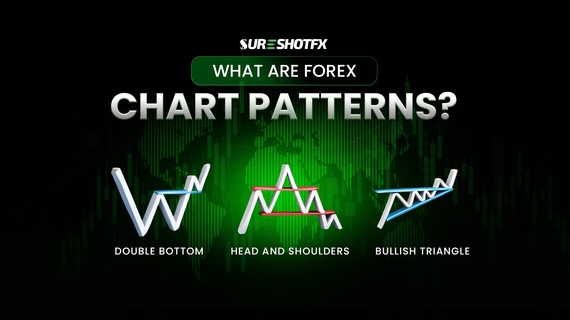
11. What is Forex Chart Patterns? How to Use It?
Forex chart patterns are visual representations of price movement that form recognizable shapes on a chart. They are not magical signals, but rather snapshots of market psychology made visible. Patterns emerge because traders react in similar ways to price changes—fear, greed, and profit-taking create repeatable formations.
Understanding what are forex chart patterns is a core part of forex technical analysis basics, as they provide insight into potential price behavior. By observing these shapes, traders can interpret the underlying market sentiment and anticipate possible trends without assuming certainty.
Why Do Forex Chart Patterns Matter in Trading?
Traders use chart patterns to bring clarity to their decision-making. Patterns act as decision tools, helping frame probabilities rather than guaranteeing outcomes. For example, a “head and shoulders” pattern doesn’t predict a price drop with certainty, but it signals a higher likelihood of reversal based on historical trader behavior.
Recognizing patterns allows traders to manage risk, optimize entry and exit points, and gauge market sentiment. The importance of chart patterns lies in their ability to simplify complex price movements into actionable context, giving traders a structured lens through which to view price action.
Using patterns as guides rather than standalone strategies is crucial to avoid misinterpreting the market.
Types of Forex Charts
Before diving into patterns themselves, it’s essential to understand the types of charts where they appear. Different charts provide varying levels of detail, each with unique uses for analysis.
Bar Chart
Bar charts show the price range for a given timeframe using vertical lines with small horizontal ticks indicating opening and closing prices. Each bar represents a snapshot of buying versus selling pressure.
Line Chart
Line charts connect closing prices over time, forming a continuous line. They are the simplest chart type, often used by beginners to observe general price direction without the distraction of intraday noise. While line charts are great for spotting overall trends, they have limitations for pattern trading because they omit opening, high, and low prices, which often hold critical signals for pattern recognition.
Candlestick Chart
Candlestick charts dominate forex pattern recognition because they display opening, closing, high, and low prices in a visually intuitive format. The body of a candlestick represents the difference between opening and closing prices, while wicks show price extremes.
Candlesticks act as emotional snapshots of the market—revealing moments of bullish or bearish pressure—and allow traders to identify patterns like flags, triangles, and engulfing candles. They are essential for anyone serious about pattern-based trading.
How Forex Chart Patterns Form
Patterns repeat across markets and timeframes due to consistent crowd behavior and institutional trading activity. Large traders often operate in predictable ways around liquidity zones, creating price movements that smaller traders can detect as patterns.
Psychological tendencies—fear, greed, and herd behavior—cause certain price formations to recur, making patterns reliable as probability signals, not guarantees.
How to Identify Forex Chart Patterns Correctly
Correct pattern identification is a process-driven skill. Begin by selecting an appropriate timeframe and observing the prevailing trend. Look for clear formations rather than forcing shapes onto charts. Confirm patterns with additional indicators or trend analysis instead of acting on assumptions.
Successful traders rely on verification to distinguish high-probability patterns from random price noise. How to identify chart patterns and develop forex pattern recognition skills is key for reducing false signals and improving trading accuracy.
Common Mistakes Traders Make with Chart Patterns
Even experienced traders can fall into traps. Common errors include seeing patterns where none exist, ignoring trend context, and trading unconfirmed breakouts. Overtrading patterns or misinterpreting signals can lead to losses and erode confidence. Recognizing chart pattern mistakes helps beginners avoid common pitfalls such as chasing false breakout forex setups and overleveraging positions based on incomplete analysis.
Conclusion
Forex chart patterns are visual tools that reveal collective market psychology. They work by highlighting tendencies in trader behavior, not by predicting the future. Beginners should approach patterns as guides to support decision-making, manage risk carefully, and combine them with trend context and confirmation techniques.
Patterns are effective when understood as probability frameworks rather than absolute signals, giving traders a structured way to interpret market movements.
This is What You Learned Today-
- Forex chart patterns
- Traders use patterns to assess probabilities, manage risk, and frame decisions
- Bar, line, and candlestick charts
- How Patterns form
- What correct identification requires.
- What are the common mistakes made